Design systems that scale
How we helped a fintech scale from 3 to 15 product teams with one design system
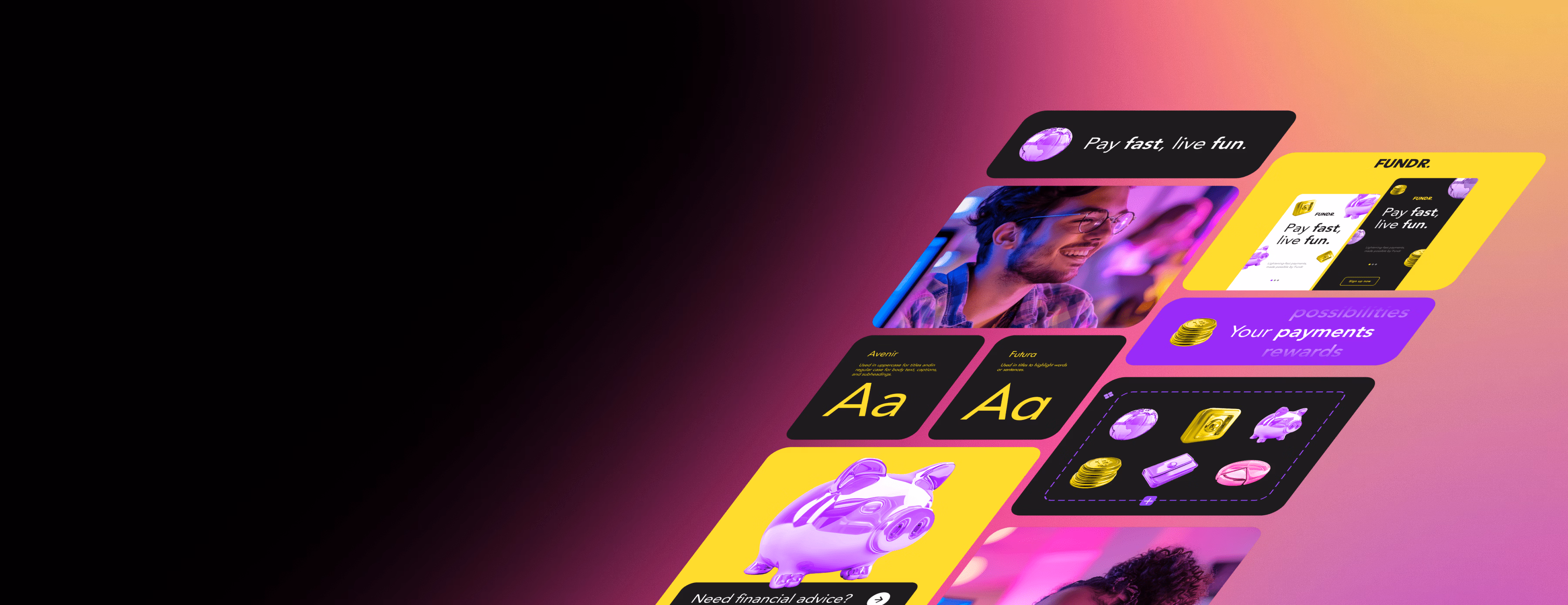
A rapidly growing fintech was drowning in design debt. Each product team was building their own components, creating inconsistent experiences across web, iOS, and Android. We built a comprehensive design system with 250+ reusable components, design tokens for cross-platform consistency, and interactive documentation. The result: 4x faster design-to-dev handoff, 92% reduction in visual inconsistencies, and teams shipping 3.5x more features per sprint.
End-to-end systems. Future-proof.
From component libraries to documentation—everything your team needs to build at scale
Component Libraries
Reusable UI components in Figma, React, Vue, or Angular. Buttons, forms, modals, tables, cards—everything your team needs.
Design Tokens
Colors, typography, spacing, shadows defined as variables. Cross-platform consistency (web, iOS, Android).
Pattern Libraries
Complex patterns like navigation, authentication, onboarding, data tables. Pre-built templates for common screens.
Documentation Sites
Interactive documentation portals. Component usage examples, code snippets, design principles, contribution guidelines.
Accessibility Standards
WCAG AA/AAA compliance built into every component. Color contrast checking, keyboard navigation, screen reader support.
Figma-to-Code Workflows
Seamless handoff from design to development. Auto-generated code from Figma components. Version control, change tracking.
How we work: Audit to implementation
From design debt audit to fully implemented, documented design system
Audit & Foundation
We audit your existing designs, identify patterns and inconsistencies, and define the foundational elements: color systems, typography scales, spacing units, component taxonomy. This creates the single source of truth for your entire product ecosystem.
Component Development
Build reusable components in Figma and code (React, Vue, Angular). Each component is accessible, themeable, and documented with usage examples. We create both primitive components (buttons, inputs) and complex patterns (navigation, forms, tables).
Documentation & Rollout
Launch interactive documentation portal with code snippets, usage examples, design principles, contribution guidelines. Train teams on adoption, establish governance, and set up automated version control and change tracking.
Built for teams that ship at scale
Enterprise Product Teams
Unify design and development across multiple products, teams, and platforms. Maintain brand consistency at scale while accelerating feature delivery.
- Cross-platform component libraries (web, iOS, Android)
- Design token systems for global theming
- Governance frameworks for multi-team collaboration
Fast-Growing Product Companies
Ship features faster without sacrificing quality. Eliminate design debt and empower designers and developers to work in parallel.
- Rapid prototyping with pre-built components
- Figma-to-code workflows that eliminate handoff friction
- Version-controlled design assets synced with code
SaaS Platforms
Build cohesive multi-product experiences. Ensure every touchpoint feels like part of the same ecosystem, from dashboard to mobile app.
- White-label theming for enterprise customers
- Dashboard component patterns and data viz libraries
- Accessibility-first components (WCAG AA/AAA)
Design & Development Agencies
Deliver client projects faster with reusable systems. Win bigger contracts by offering design system implementation as a premium service.
- Client-ready component documentation and guidelines
- Starter kits and templates for rapid project kickoff
- Training programs to upskill internal teams
Development Shops & Studios
Reduce development time and minimize bugs with battle-tested component libraries. Ship pixel-perfect implementations every time.
- Framework-agnostic components (React, Vue, Angular)
- TypeScript definitions and comprehensive API docs
- Automated visual regression testing setups
Funded Startups Scaling Fast
Avoid technical debt from day one. Build a design system that scales with your team from 5 to 50+ people without major refactors.
- MVP-ready starter components for quick launches
- Scalable architecture that grows with team size
- Documentation that onboards new hires in hours
Power your design system with complementary services
A design system is the foundation. Bring it to life with product design, development, and strategic consulting.
Branding Services
Establish your brand foundation before building a design system. Define colors, typography, and visual language that scales.
Web Design
Apply your design system to real products. Build conversion-optimized websites using your component library.
AI Employees
Automate design system maintenance with AI. Generate components, update documentation, and catch inconsistencies automatically.
Frequently Asked Questions
Everything you need to know about design systems
Ready to build your design system?
Let's create a design system that scales with your product, accelerates development, and ensures consistency everywhere. Component libraries that empower teams.
Related OARC Digital services
Other services that work well alongside this one.